Bizworks Native Mobile App


Summary
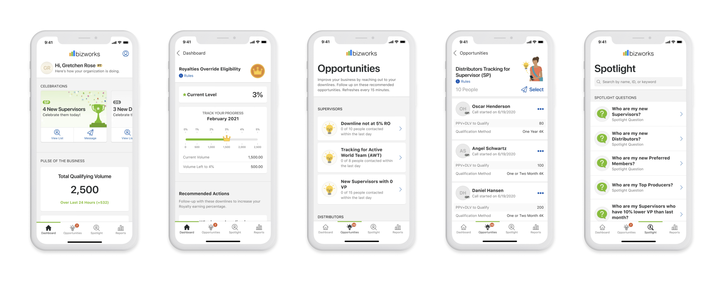
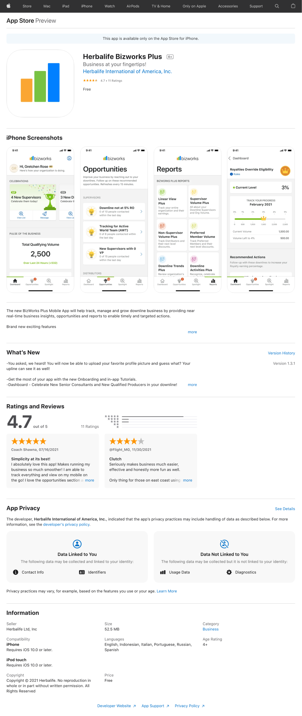
The Bizworks Plus Mobile App helps to track, manage, and grow downline business by providing near real-time business insights, opportunities, and reports to enable timely and targeted actions and communications. It uses artificial intelligence to provide insights to our distributors, push notifications, social media, and messaging integration with Whatsapp and Telegram. It has been launched in 94 countries and every language in just over one year. In only 3 short months after it’s launch in July 2021, the app had over 1 million visits — and in 6 months over 3 million.
My Role on the Bizworks Team
UX Team Lead
Managing a team of 3 Designers and Researchers
Stakeholder Alignment
Design Demo Presentations
Roadmap Alignment and Prioritization
SAFE Agile Program Planning
Weekly Program Syncs
UX Designer
Problem-Solution Mapping
Wireframing
End-to-End Prototypes
UX Briefs
Comparative/Competitive Analysis
Expert Reviews
Discovery and User Research
Usability Testing
UI Design
Tools Utilized
Figma
Mural
Jira
Confluence
Mockup
Pen & Paper
Project Length: From start to launch was one year, followed by continuous growth and iterations based on customer feedback and needs.
Team Size: 50+. This included 3 UX/UI Designers, 1 Researcher, and 4 teams consisting of Developers, QA, Product Managers, and other specialists.
Understanding the Problem
Herbalife operates as a multi-level marketing model. Distributors of Herbalife’s products make sales directly to customers, but importantly, also recruit and mentor others to build their own sales teams to earn commissions. The Distributors all have different models that they develop personally over time. They find out what works in their area and grow based on what their clients want and need.
We found that many Distributors were manually creating and updating spreadsheets daily to calculate a range of metrics essential for growing their businesses. Top performers also had to teach these methods to their downlines to ensure consistent growth across their organizations. This was placing a heavy administrative burden on them, consuming valuable time that could be spent on more impactful activities.
In addition, Distributors were using multiple platforms to communicate with their downlines. They needed tools to share visual data, send individual and group messages, raise alerts about business issues, and celebrate successes. Building a supportive, engaged community is a key part of the Herbalife model, and managing all of this across disconnected tools was becoming increasingly inefficient.

Direction
We saw our Distributors struggling to juggle it all, so to support them and drive growth across the wider Herbalife business, Bizworks was born.
We wanted to build it with every Distributor level in mind - from newer recruits to seasoned leaders, offering tailored dashboards and metrics that would speak directly to each tier’s goals and challenges.
And because timing matters, we wanted to make the data actionable. The moment a number needed attention, we wanted Distributors to be able to tap and message a downline, plan a promotion, or congratulate a top performer - all from this app, on the go.
Computers, spreadsheets, and scattered chat threads? Gone. What we wanted was a clear path for Distributors to focus on what really counts: growing their community, not paperwork.

Foundations
We started with a basic list of enablers, essential flows needed for our MVP. This included things like Login, Main Dashboard, Opportunities, and Spotlight. Our reports section for MVP would house legacy views of the reports that our users needed access to. For each flow or section of the app, we worked on requirements with our Product and Dev teams, aligned on timelines and delivery of work through the SAFE agile methodology.
With this work aligned across the team, we began designing the application, step by step.
Each enabler was assigned to a designer, broken down into tasks and set for a specific delivery cadence following development sprint timelines.
Kicking Off

My process for each enabler ticket began with the UX Brief. The UX Brief is a sync with all of the main stakeholders: Director, Product Owners, Architecture, Development, and Product Managers. This meeting is an alignment call to review and produce a list of “knowns and unknowns” that help the design team understand the previous research and requirements, why we are building “this thing”, and get any ideas out on the table.
The sync is an essential meeting that helps the team connect and understand what the expectations are before formal design begins. It’s usually anywhere from a 30-minutes to 1-hour call (depending on the subject)
In this call, we go through a series of questions and document the answers the team provides, live and on-screen. The idea is for every voice to be heard, every opinion understood, and to come out of the session with a consensus of what the design will encompass.
Competitive/Comparative Analysis
From there, I would begin a competitive/comparative analysis of the feature or flow to help inform my designs. I researched what was going on with any competitors, and looked at patterns and ideas that top companies were using across the digital space - looking to companies like Google, Amazon, Instagram, Airbnb, etc.
The information gathered during the analysis was added to my Figma files and used as a reference when creating the initial flows and drawings.

One example of comparative analysis used to help inform our “Filters” enabler.
User Flow

The next step was to map out the user flow. This is imperative to understand the various points in which our user needed to make decisions and interactions. It helps define the “happy path” vs. other paths that the user might take as all of these needed to be accounted for.
Drawings
All of the previous steps (UX Brief, Analysis, and User Flow) were the foundation for the drawings. I would draw out the flow required, including the full screen, so that any feature was in full context. The main flows were accounted for, as well as any obscure or smaller items.
The work up to here would be presented to the same stakeholders in a Drawing Session for discussion and feedback. In this session, we would talk about pros and cons, sometimes adding ideas, scrapping and recreating some elements of the design - it was a time of collaboration for the team to see the vision through.

Wireframes
The designs were then made into a wireframe prototype and presented to the team again for review. The wireframe prototypes included all flows and the various states that may occur during the flow (active state, disabled, empty, error state). From here, we would discuss the design and flow, and any plans for usability testing. We often tested our flows with users at this stage to ensure that we were designing something intuitive and understandable to our users.
Usability Testing
We did a myriad of usability tests for this application. We performed user testing with generic users, but more often with a group of “Power Users” who were going to be subscribing to our application. The community at Herbalife was very open and hands-on. Many of our Distributors were like partners in the effort.
With support from my researchers, Rob and Sergi, we ran usability tests through the User Zoom platform, collecting data to understand pain points and/or moments of delight.
Additionally, I performed many user interviews, watching our Power Users experience a variety of flows through the application, and following up with relevant questions related to what was happening on-screen and in their mind. In these cases, I was collecting the feedback and sorting it into themes, then analyzing it to understand the users’ wants and needs. We would use this information to assign priority to new features or iterations for our product road map.

Hi-Fi Designs
Following feedback from stakeholders and our users, I would begin the UI Designs, creating all visual details and prototypes to correspond with the original wireframes. For several months, I was creating both UX and UI designs for the application. The designs shown below are a sample of my creations. Later, we hired a dedicated UI Designer to the team, and once onboarded, the team collaborated extremely well together, discussing all UX ideas together and further translating the designs into the final vision. It was a collaborative process involving the UX team and our stakeholders. We communicated well and valued each other’s input on the direction of the application.
Handoff to Development
Handoff included several steps. Our team regularly presented wireframe prototypes in our Bi-weekly demos to prepare product and development for what was being delivered. We used these prototypes for the initial Product Team's assessment, and then the completed UI prototypes in Figma to handoff to development. Additionally, our handoffs included video recordings of the hi-fi flows with a voice-over that explained the functionality and details of each new element or feature. We did this to work seamlessly together across multiple time zones.
During the development process, our team met with key developers to QA the work. We collaborated and problem-solved together, sometimes coming up with innovative solutions that made our app infinitely better.
App Usage & Ratings
The app was specifically created for Herbalife Distributors as a subscription model. The price for a subscription was set at approximately $7.95/month.
As you can see from the data below, the app was doing very well with our users with over 12 million visits after just one year of launch and over 43, 000 Distributors subscribed. Additionally, the app was well-received and rated highly in the App Store and on Google Play.


Learning Points
In this role, I learned how to refine my design process and produce consistent work in an agile environment, aligning with SAFE methodology. Through this process, I also learned a great deal about prioritization and program increment planning. Within a year of being in at the company, I was leading the UX team and actively collaborating with Directors and Product Owners on prioritization, driving user-centered, data-backed features and iterations for the Product Road Map.
Being on this team was one of the best learning environments that I have been in. Each team member had their specialty and owned it extremely well. We communicated openly and shared ideas that allowed us all to grow in our own different directions.