Design System

Summary
Measureyes is an A/B testing platform that allows retailers to track the success of their storefront window displays by utilizing data based on head-turn rates (HTR) and facial recognition. You can learn about the project here in my portfolio.
The project is ongoing and in its early stages, so to help organize my work and eliminate any confusion, I’ve set up this Design System for the team. It will help us accelerate the process for future designs and become a bridge between the designers and developers working on the Measureyes products.
Logo & Brand Colors
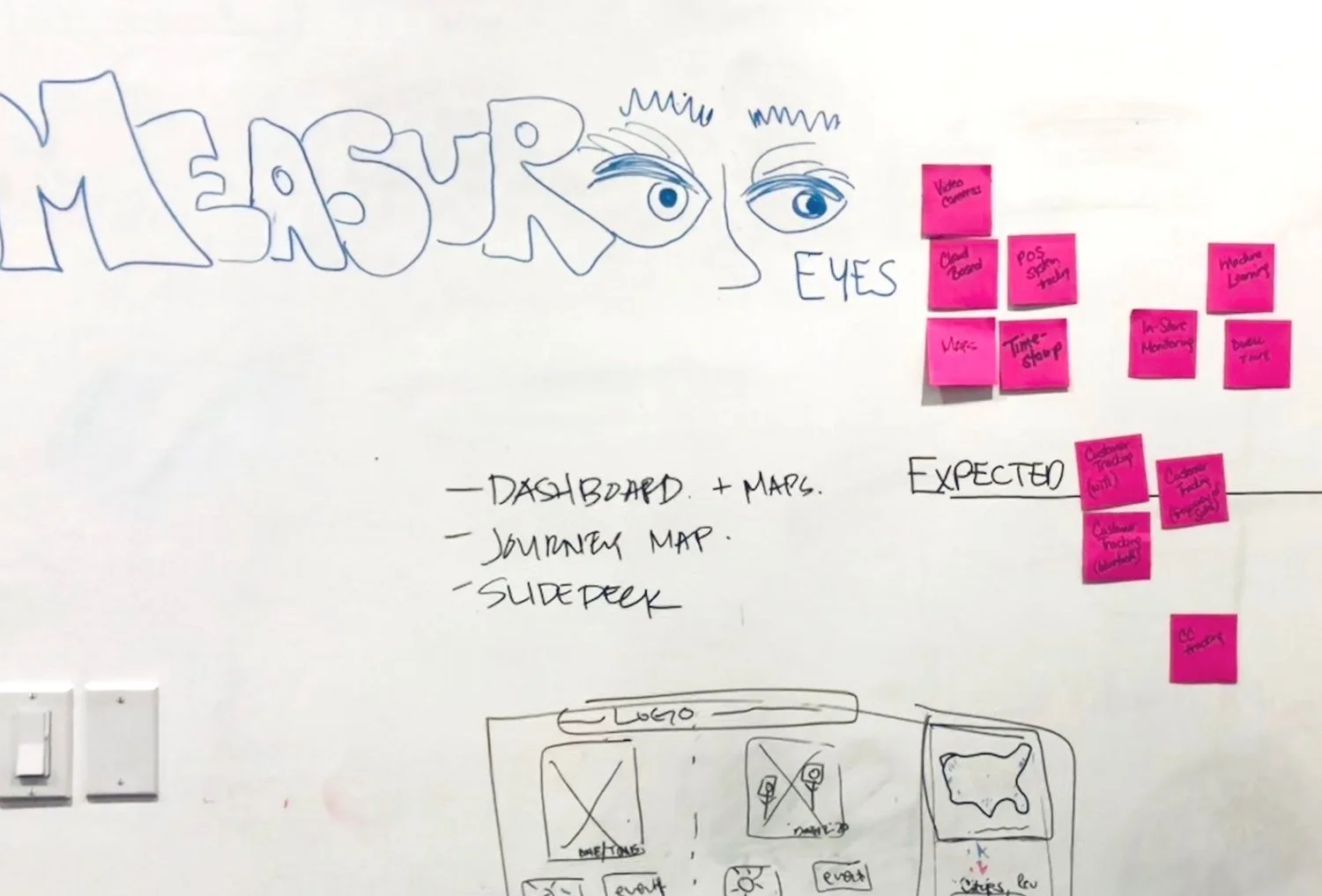
The Measureyes logo took shape in a brainstorming session during the hackathon from which the project originated. I adapted the logo from the team name that I had drawn in our whiteboard space. (image: below)
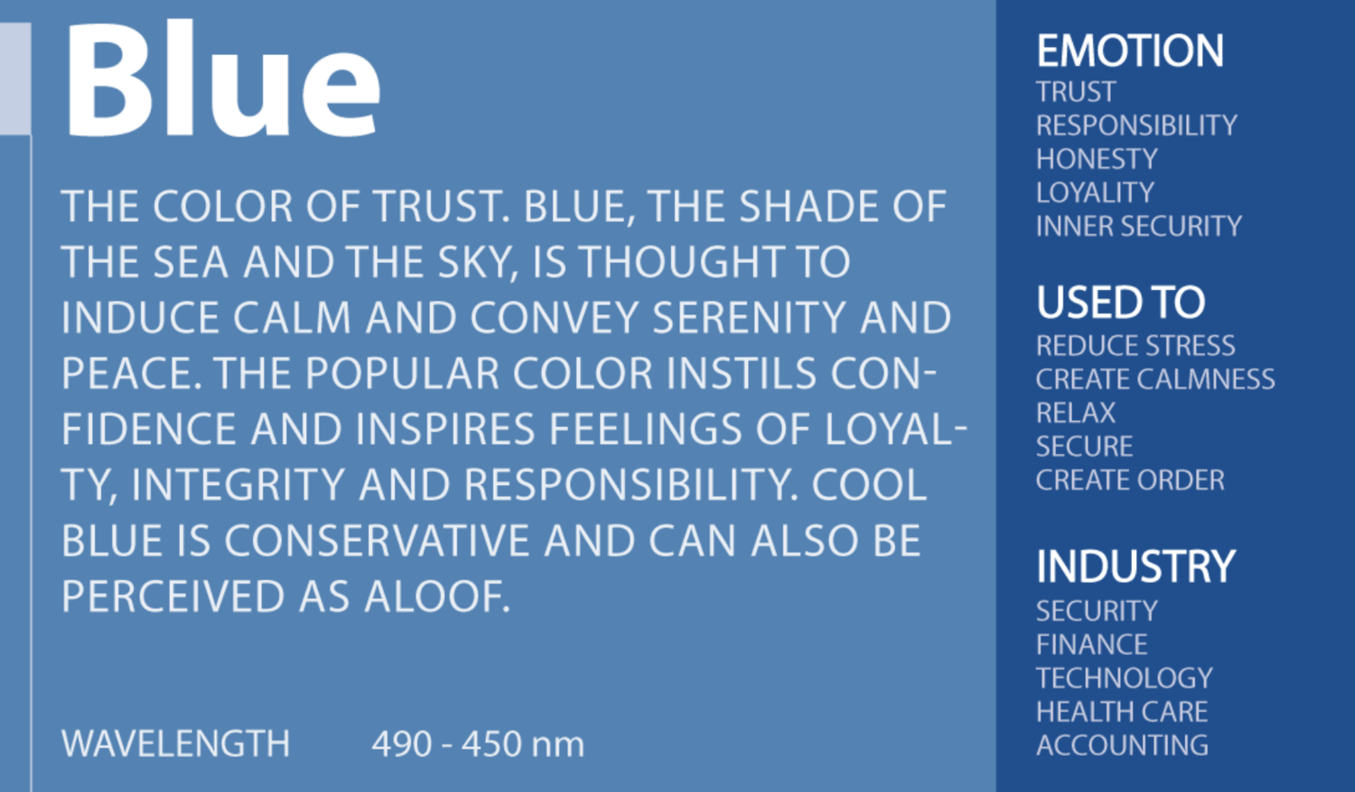
The logo font and colors were selected because I wanted the word “eyes” to resemble a person’s face. The font family Nunito Sans offered a nice round “e” shape and the clean-looking letter “y”, which lead me to choose this font style. As for color, I wanted to use a real-life eye color and decided on blue because of what the color represents: Trust, confidence, integrity, and technology. (image: below)
The team then got together and decided on a shade of grey for the rest of the logo, I created the eyebrows, played with the kerning, and the logo was born.
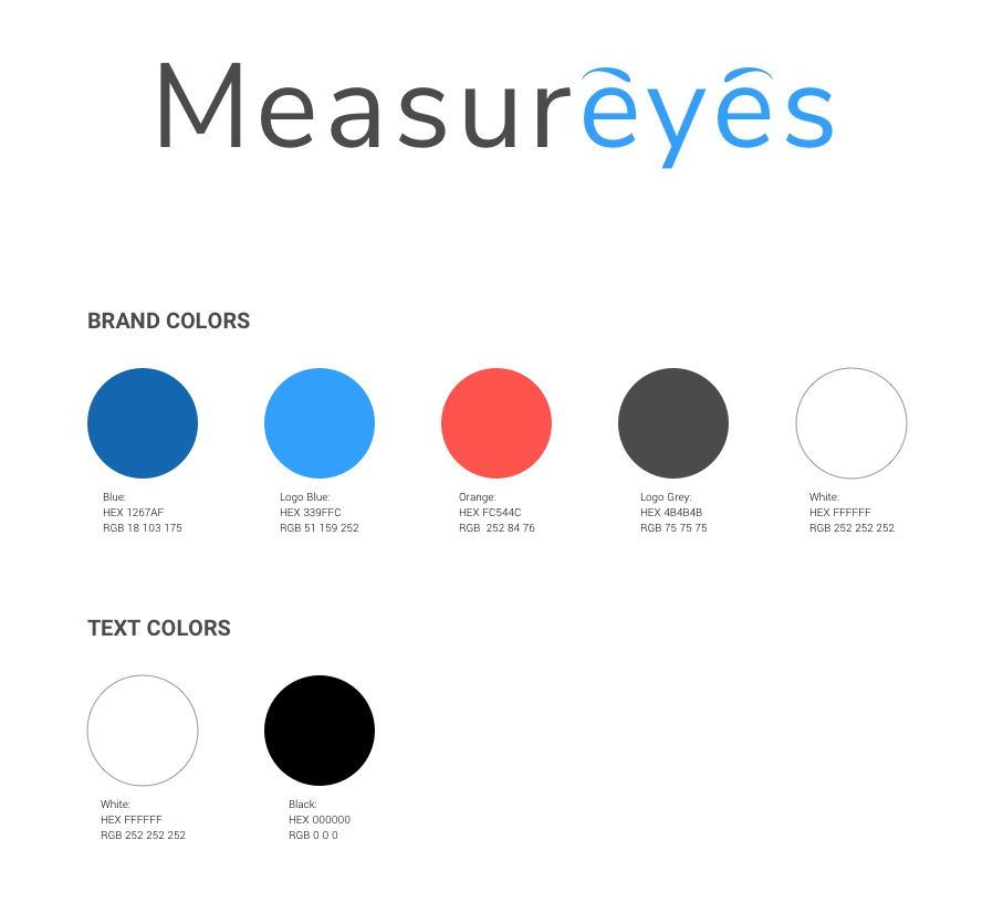
With the help of Adobe Color CC, I created the color palette based on the chosen logo blue. I carefully selected a mix of supporting to pair with our primary “blue” and brought the palette to the team for discussion and approval.
Logo Uses
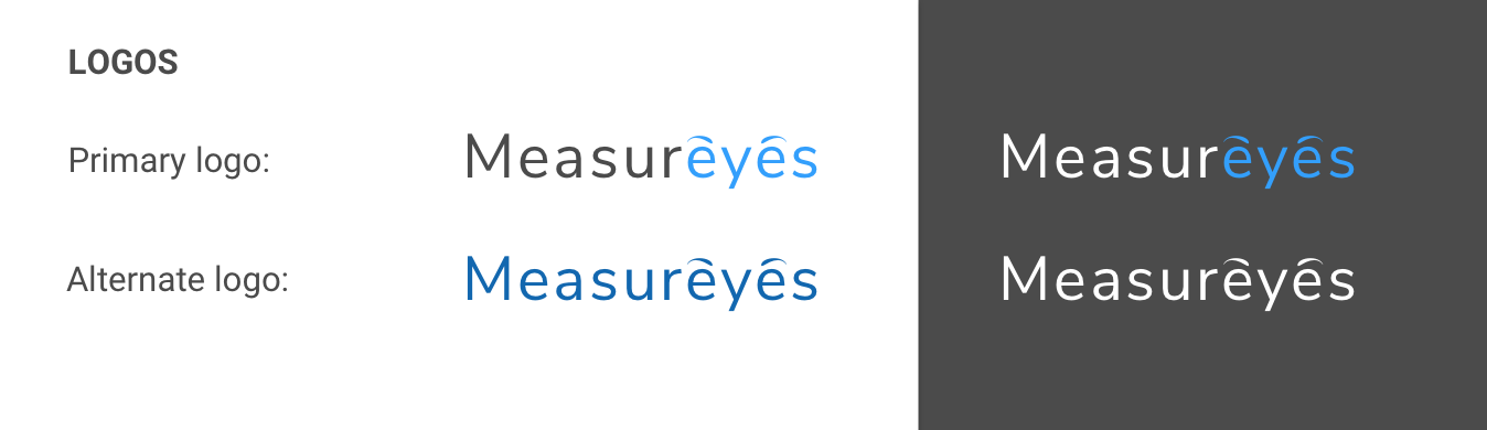
In addition to the primary logo, alternate versions of the logo were created for different backgrounds and purposes.
Color System
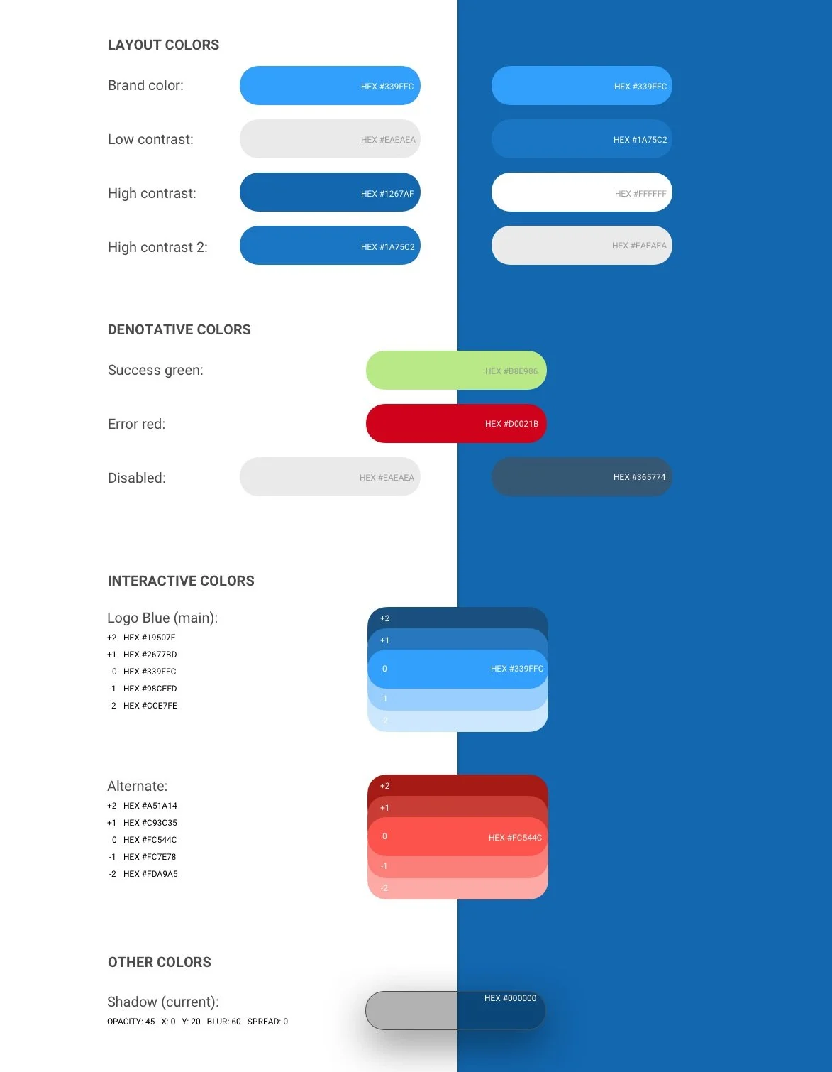
I went on to design the basic color scheme for the Measureyes products. My goal was to create something simple that would allow for brand consistency. The format would allow the team to access the color codes easily.
Layout colors were selected for web and mobile use in contrasting tones that would appear on both light and dark backgrounds.
Denotative colors were selected for success/error messaging and disabled states.
Interactive colors were selected for buttons and other CTAs with corresponding colors for use in state changes such as hover and click.
I also wanted to document the type of drop shadow that I have been using, so I added this under "Other Colors."
Typography
Two font families were selected for the Measureyes brand. For larger headers, I decided to stick with the font family "Nunito Sans" to maintain brand consistency. The font family "Roboto" is used for body text and smaller text, like button labels.

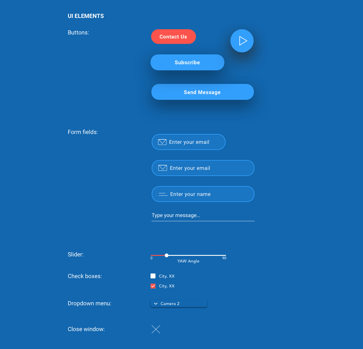
UI Library
This collection of components is the UI Library that I created while making the webpage and dashboard for the Measureyes products. These are reusable components for use across all products. It is intended to be a library that will grow and change over time as more features and iterations occur.
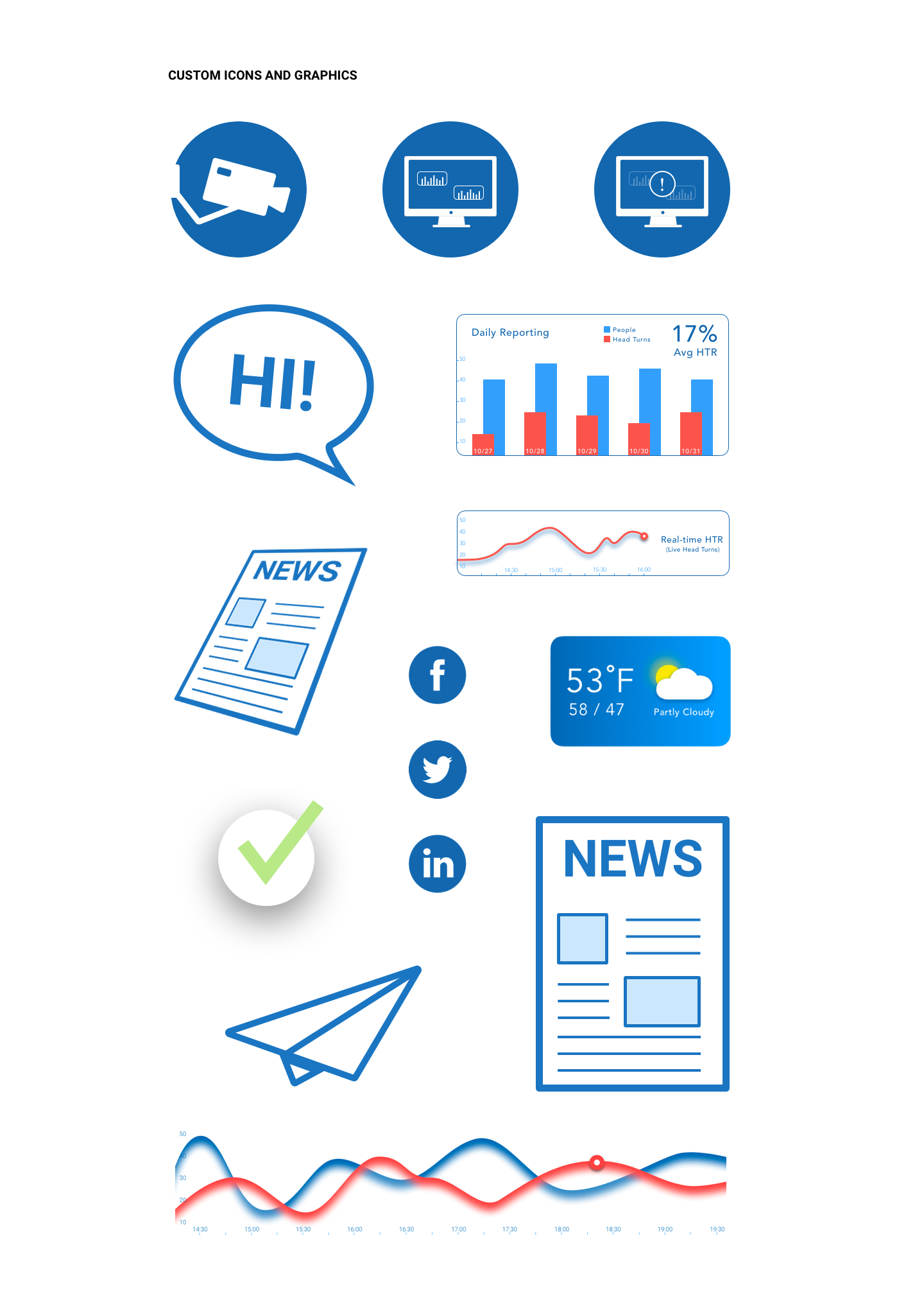
Iconography
The iconography contains a set of custom icons and graphics that were created for the Measureyes products. The design aesthetic is simple, informative, and engaging and utilizes the brand's colors.
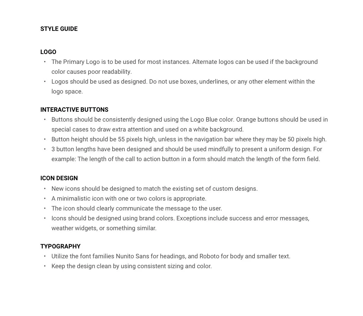
Style Guide
I’ve created a small list of styling rules to promote consistency within our brand.
Learning Points
During the initial dashboard design phase, the team started from scratch. We didn’t have colors or branding, and we were building our concept product as quickly as possible to meet our tight deadline (10 hours). When we decided to move forward with the project as a business, things began to take shape through a lot of trial and error. I’d designed only a few things for the dashboard with no Design System to speak of. Looking back, I should have first created a basic layout as it would have made things easier.
The Design System is growing as we develop this product. I’ve learned that it is necessary to keep all the artifacts in one place and well-organized. It is extremely important when handing off assets to developers.
The components built during this process will keep my designs consistent when doing future work with Measureyes. In more recent projects, I have made designing reusable components a priority from the start. I used to think that things needed to be perfect before I created a component, but I've learned that there is always room for some iteration.
Next Steps…
This project is currently on hold, so I've decided to create the Design System for another project: RAM Automation’s “Formulator”. The RAM Automation project was much more robust and contains more complicated components. At the moment, I am busy bringing the designs from Sketch to Figma, and recreating the reusable components as I go. It will eventually be added to my portfolio when complete.